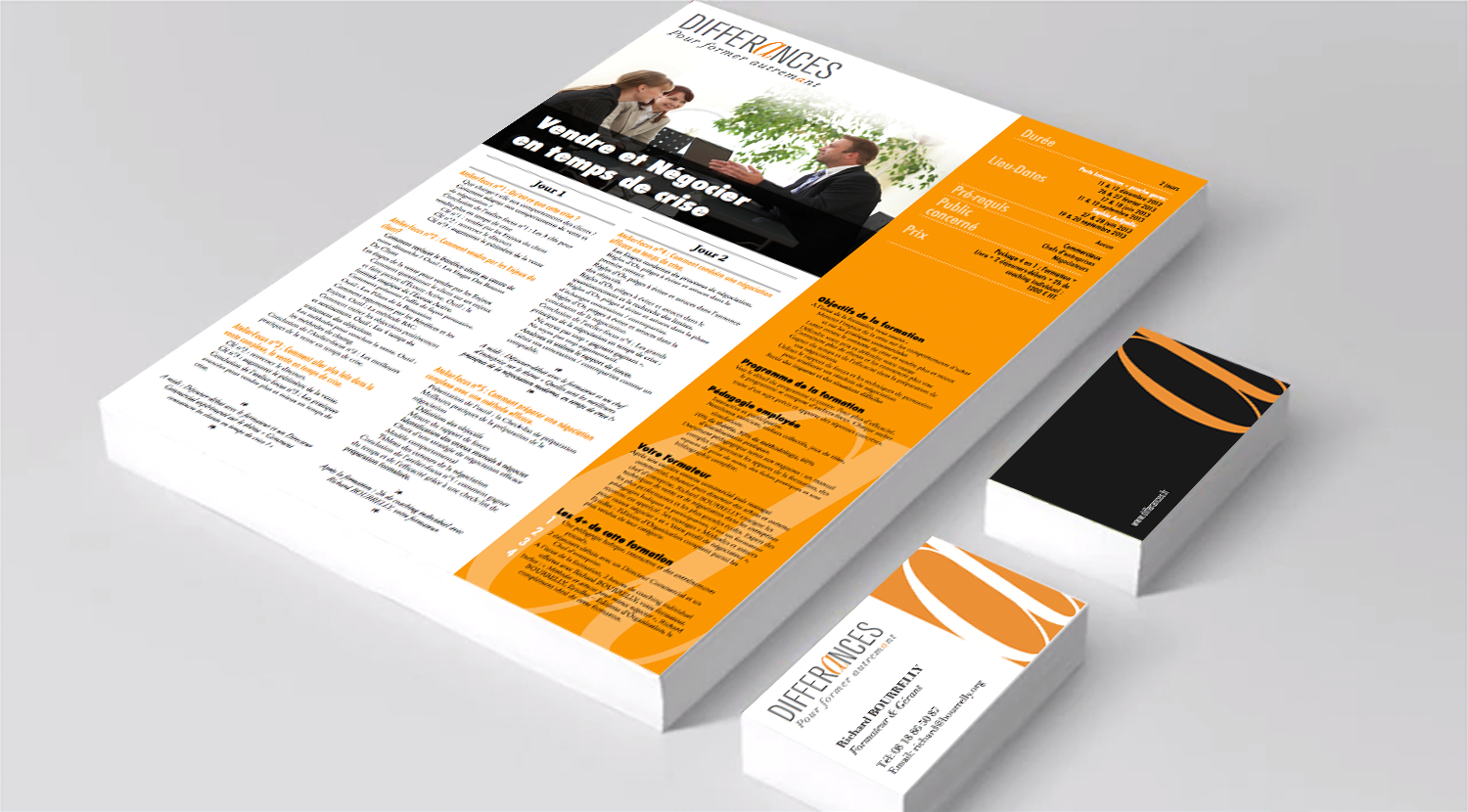
Project objective: to redesign the existing logo building on the letter A in the word Differances in order to create a brand identity for a training firm that uses different methods. The Didot italic typeface chosen for the letter A provides not only a contrast with the other letters but also with the regular lower case (a as opposed to a).
The new logo was then used to create business cards and brochures.
We use cookies to ensure that we give you the best experience on our website. If you continue to use this site we will assume that you are happy with it.Ok