Here is a new logo I designed recently for CoFab, a professional codevelopment firm. Invented in Canada 15 years ago, professional codevelopment is a collaborative problem solving method using a group of people. It can be used in organizations or businesses as a training for professionals.
In its brief, CoFab wanted a logo that would be serious with a strong human component. CoFab promotes exchange between peers and aims at recreating a healthy social fabric through its facilitated sessions.
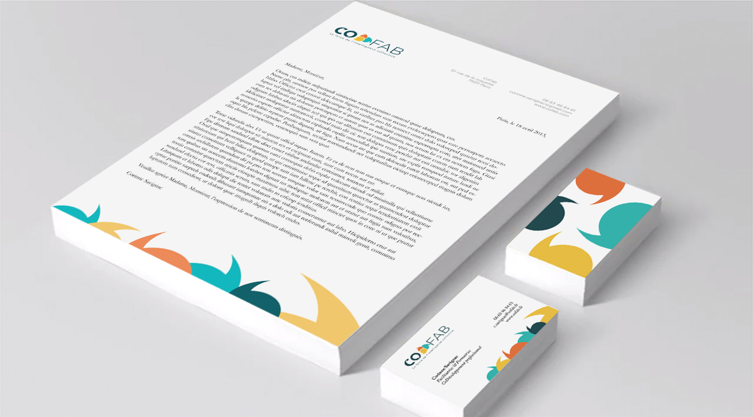
After I did my preliminary research on the industry and the competition, I decided to create a logo based on dialogue and communication between people. Negative spaces within the letters C and O have the shape of quotation marks which are well known symbols of verbal communication. I used a positive version of the same shape again to create bubbles as another symbol of verbal communication. The three bubbles are entangled to represent collective intelligence and suggest that the global exchange in a group is greater than the sum of the individual contributions. The colour palette proposes fresh, vivid and innovative hues while being serious and reliable thanks to the dark blue. I then used the look and feel of the logo to create stationary (see image above).
Please let me know what you think in the comments below…


One Comment